Disclosure: This post may contain affiliate links. I may earn a commission if you shop through my links, at no extra cost to you. We only recommend products we'd genuinely suggest to a friend.
If you’ve been scrolling through Pinterest lately, you’ve probably noticed a shift — a cool, calm, quietly confident shade of blue is taking over. Cool blue has officially landed at the top of Pinterest Predicts for 2026, and interior designers everywhere are embracing it with open arms. After years of warm beiges and earthy terracottas ruling our rooms, this serene, sophisticated palette feels like a breath of fresh air. Whether you’re planning a full renovation or simply looking to refresh a corner of your home, cool blue might just be the most transformative thing you can do this year.
Why Cool Blue? A Shift from Warm Neutrals
For the better part of a decade, warm neutrals reigned supreme. Greige walls, terracotta pots, and honey-toned wood created interiors that felt cozy and grounded — and for good reason. But design, like fashion, moves in cycles, and our collective mood is shifting. After years of leaning into warmth and earthiness, there’s a growing desire for something that feels a little more expansive, a little more serene.
Cool blue answers that call beautifully. Where warm neutrals wrap you in a hug, cool blue opens a window. It evokes the feeling of a clear sky on a crisp morning, the stillness of a lake at dusk, or the quiet calm of a well-loved library. It’s not cold — it’s composed. And in a world that often feels overwhelming, that sense of visual calm is deeply appealing.
This isn’t a rejection of warmth so much as a rebalancing. The best cool blue interiors still layer in texture, natural materials, and soft lighting — they simply anchor everything with a palette that feels fresh, considered, and genuinely timeless.
The Best Shades of Cool Blue
Cool blue isn’t a single shade — it’s a whole family of tones, each with its own personality. Here are the ones to know:
Dusty Blue is the softest and most livable of the bunch. It has a slightly muted, almost powdery quality that makes it incredibly easy to live with. Think of it as the cool-toned cousin of a classic grey — it works beautifully in bedrooms and living rooms where you want a sense of calm without drama.
Slate brings depth and sophistication. It’s a darker, more complex blue with grey undertones that give it a moody, anchoring quality. Slate works brilliantly as an accent wall, in cabinetry, or in spaces where you want to create a sense of intimacy and weight.
Powder Blue is light, airy, and effortlessly pretty. It has a vintage quality that pairs beautifully with antique furniture and natural linen. Use it in spaces where you want to amplify natural light and create a sense of openness — it’s particularly magical in north-facing rooms that need a little lift.
Cerulean is the boldest of the family — a vivid, clear blue that sits right between sky and sea. It’s energising without being aggressive, and it works wonderfully as a statement colour in kitchens, entryways, or as a pop of colour in an otherwise neutral room.
Room by Room: How to Use Cool Blue in Your Home
The beauty of cool blue is its versatility. It can anchor a whole room or simply whisper through an accent. Here’s how to make it work in every space.
Living Room
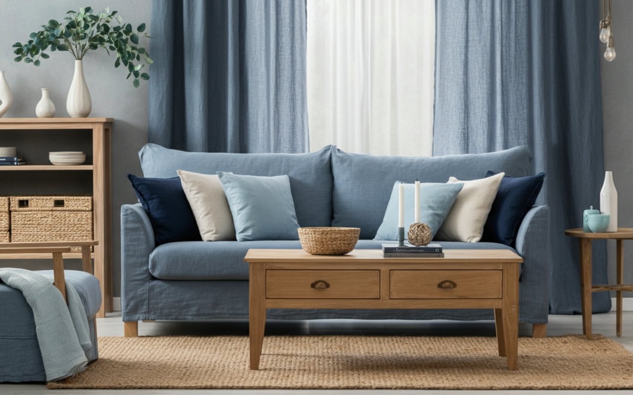
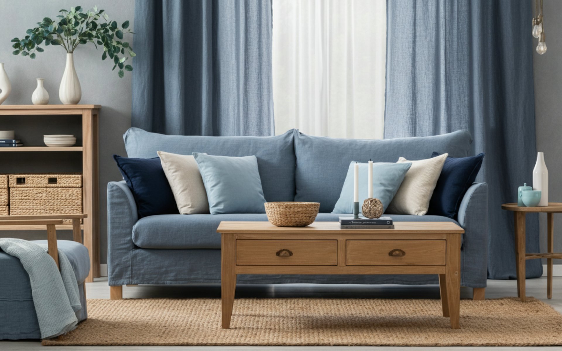
The living room is the perfect place to commit to cool blue in a meaningful way. Consider painting your walls in a dusty blue or slate and letting the colour do the heavy lifting. Balance it with a cream or oatmeal sofa, warm wood coffee table, and plenty of textured cushions in natural linen or boucle. If you’re not ready for walls, a large blue sofa or a statement armchair in cerulean can anchor the room just as effectively. Layer in a jute rug and some brass or aged bronze lighting to keep the space feeling warm and inviting rather than stark.
Bedroom
Cool blue and bedrooms are a match made in design heaven. The calming, sleep-inducing quality of blue makes it an ideal choice for a space dedicated to rest. Powder blue walls with white linen bedding and warm wood furniture creates a bedroom that feels like a boutique hotel — serene, considered, and deeply restful. For a moodier take, try slate on a single feature wall behind the bed, paired with warm lighting and layered textiles in cream, camel, and soft white. The contrast between the cool wall and the warm bedding creates a beautifully balanced, cocooning effect.
Kitchen
Kitchens in cool blue are having a serious moment, and it’s easy to see why. Blue cabinetry — whether in dusty blue, slate, or cerulean — instantly elevates a kitchen from functional to genuinely beautiful. Pair blue lower cabinets with cream or white uppers to keep the space feeling light and balanced. Brass or unlacquered brass hardware is the perfect finishing touch, adding warmth and a touch of vintage charm. If you’re renting or not ready to repaint cabinets, blue tiles — whether a classic subway tile in a cool blue glaze or a more decorative encaustic pattern — can bring the palette in through the splashback.
Perfect Pairings: Colors and Materials That Love Cool Blue
Cool blue is a generous colour — it plays beautifully with a wide range of materials and tones. Here are the combinations that really sing.
Linen is cool blue’s best friend. The natural, slightly nubby texture of linen softens the crispness of blue and adds an organic warmth that stops the palette from feeling too polished or cold. Use linen in curtains, cushions, and upholstery for an effortlessly layered look.
Warm wood is the great balancer. Whether it’s a honey oak floor, a walnut dining table, or a rattan side chair, warm wood tones ground a cool blue palette and prevent it from feeling clinical. The contrast between the cool blue and the warm grain of natural wood is one of the most satisfying combinations in interior design.
Brass accents add glamour and warmth in equal measure. Brass taps, light fittings, picture frames, and hardware all work beautifully against cool blue, creating a sense of considered luxury. If solid brass feels too bold, aged or brushed brass offers a softer, more understated version of the same effect.
Cream is the neutral that ties everything together. Where pure white can feel stark against cool blue, cream has just enough warmth to bridge the gap. Use cream on ceilings, woodwork, and soft furnishings to create a palette that feels cohesive, layered, and genuinely livable.
Styling Tips: Fresh, Not Cold
The biggest concern people have about cool blue is that it might make a space feel chilly or unwelcoming. Done well, it absolutely won’t — but there are a few key principles to keep in mind.
Layer your textures. The more tactile variety you introduce, the warmer a cool blue room will feel. Think chunky knit throws, woven baskets, velvet cushions, and rough-hewn ceramics. Texture catches light and creates visual warmth that colour alone can’t achieve.
Get your lighting right. Cool blue is sensitive to light. In rooms with warm, incandescent-style bulbs, it will feel cosy and inviting. In rooms with harsh, cool-toned lighting, it can tip into feeling cold. Opt for warm-white bulbs (around 2700K) and layer your lighting with floor lamps, table lamps, and candles to create a soft, enveloping glow.
Bring in warm accent colours. You don’t need to abandon warmth entirely — you just need to use it strategically. A terracotta pot, a rust-coloured book, a warm amber glass vase — these small pops of warmth act as counterpoints to the cool blue and make the whole palette feel more dynamic and alive.
Don’t forget greenery. Plants are one of the easiest ways to make any cool-toned room feel more alive and welcoming. The natural green of foliage bridges the gap between cool blue and warm wood beautifully, and the organic shapes of plants add a softness that balances the crispness of the palette.
Trust the process. Cool blue often looks different on a paint chip than it does on a wall. If you’re nervous, paint a large swatch and live with it for a few days before committing. See how it looks in morning light, afternoon sun, and evening lamplight — you might be surprised by how warm and inviting it becomes once it’s in context.
Cool blue is more than a trend — it’s a genuine shift in how we want to feel in our homes. Calm, clear, and quietly confident. If you’ve been waiting for a sign to refresh your space, this is it. Start small with a cushion or a vase, or go all in with a painted wall — either way, you’re stepping into one of the most beautiful and enduring palettes of the decade. Your home is ready for its blue era. Are you?